全都是假的,一起來認識偽元素!
在還是學生的時代,我對咖啡的認識只有兩種,有加牛奶的叫拿鐵,沒加牛奶的叫美式。
至於其他的咖啡種類嘛,只能說是十竅通了九竅,一竅不通。
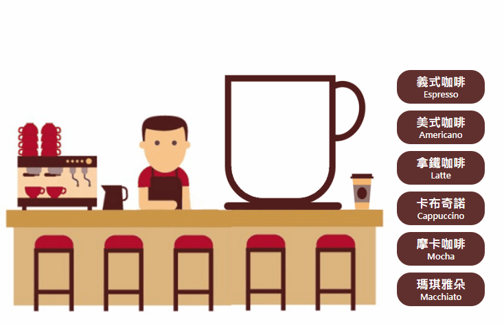
直到某次在網路上看到一張各類咖啡的成分組成圖,這才長了點咖啡家族的知識。
恰好近來在工作上比較常用到偽元素來製作畫面,於是就運用偽元素的效果,動手做了一張咖啡的種類說明(如圖)
而最近因為看到六角學院的寫文章活動,想說不如就拿這個當作範例,簡單的寫一篇關於偽元素運用方法的介紹?於是乎,這篇文章就這樣被生出來了。
也可以點此連結到我的GitHub:老闆,來杯義式濃縮佐牛奶!
什麼是偽元素?
「偽元素」它其實並不是真正網頁裡的元素,而是透過 CSS 在一個 HTML 的標籤內新增至多兩個元素,而這些新增的元素和真正網頁元素一樣,可以透過 CSS 來操控它的樣式與效果。
使用「偽元素」的好處在於,可以讓程式碼看起來比較乾淨整齊,不會太亂。
偽元素的創建方法
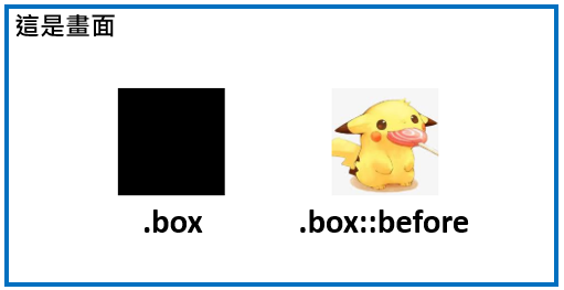
在創建偽元素之前,你得先要有一個真的網頁元素,如下方的程式碼這樣,寫了一個 class 取名為 box 的 div 元素,並設定這個 box 的背景為紅色:
<div class="box"></div> .box{
width: 100px;
height: 100px;
background: red;
}
一般來說,::before 和 ::after 大概是最常被使用的兩個偽元素, ::before 是在原本的元素「之前」建立一個新的元素, ::after 則是在原本的元素「之後」建立一個新的元素。
要特別注意的是在程式碼內,一定要具有 content 這個屬性,如果沒有 content 這個屬性的話,偽元素是不會出現在畫面上的。
下面我們就試著在原本 box 元素的前後,各新增一個 ::before 和 ::after 元素,程式碼如下:
<div class="box"></div> .box{
width: 100px;
height: 100px;
background: red;
}
.box::before{
content: ""; /*沒有加這段就不會產生偽元素*/
width: 100px;
height: 100px;
background: orange;
}
.box::after{
content: ""; /*沒有加這段就不會產生偽元素*/
width: 100px;
height: 100px;
background: pink;
}現在讓我們看看,加了程式碼後畫面有什麼不同...欸?怎麼還是一樣沒變勒?

我們可以打開Chrome的開發者工具來檢查一下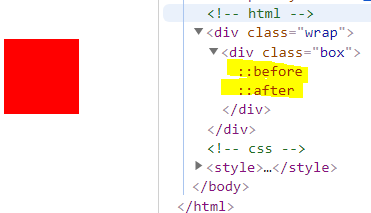
從圖中黃底的部分可以發現,確實出現了 ::before 和 ::after 兩個元素,但在畫面上為什麼看不見這兩個元素呢?
原因是因為現在還沒有給偽元素設定位置,所以現在我們用 position: relative 將原本的 box 的屬性設為相對定位,並用 position: absolute 將 ::before 和 ::after 兩個元素的屬性設成絕對定位,以及分別設定 top 和 left 的位置,其程式碼如下:
<div class="box"></div> .box {
position: relative; /*相對定位*/
width: 100px;
height: 100px;
background: red;
}
.box::before {
position: absolute; /*絕對定位*/
content: ""; /*沒有加這段就不會產生偽元素*/
width: 100px;
height: 100px;
background: orange;
top: 0;
left: -150px;
}
.box::after {
position: absolute; /*絕對定位*/
content: ""; /*沒有加這段就不會產生偽元素*/
width: 100px;
height: 100px;
background: pink;
top: 0;
left: 150px;
}現在,讓我們再看一下畫面

好極了,這下在畫面上成功出現橘色的 ::before 元素,以及粉紅色的 ::after 元素囉!
偽元素的運用
在偽元素內塞文字
如果想要在偽元素裡塞文字的話,只要直接在content屬性中輸入文字就可以了,如下:.box { position: relative; width: 50px; height: 50px; background: black; color: #ffffff; } .box::before { position: absolute; content: '這是一段文字'; width: 50px; height: 50px; background: red; bottom: 0; left: 80px; }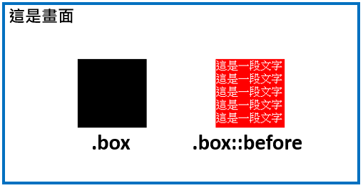
- 在偽元素內塞圖片
偽元素與真的元素一樣可以使用 CSS 做樣式的操作,所以我們可以運用background的屬性,在裡面塞進圖片,如下:
 .box {
        position: relative;
        width: 100px;
        height: 100px;
        background: black;
        color: #ffffff;
    }

    /* 在偽元素內塞入皮卡丘的圖片 */
    .box::before {
        position: absolute;
        content: '';
        width: 100px;
        height: 100px;
        background-image: url('https://encrypted-tbn0.gstatic.com/images?q=tbn:ANd9GcRWqzSddfpyA4VvGFIydhj0vcTi3hPynZ2_K5IW_ioZB-LuFjh8&s');
        background-position: center center;
        background-size: cover;
        bottom: 0;
        left: 200px;
    }
運用
:hover製作互動效果
在 CSS 中運用:hover屬性,可以設定當滑鼠滑到元素上方時,使元素呈現想要的設定結果,如下:/* 我又跳進來了 */ .box::before { position: absolute; content: ''; width: 180px; height: 125px; background-image: url('./img/img1.jpg'); background-position: center center; background-size: contain; background-repeat: no-repeat; bottom: -15px; left: -300px; } /* 我又跳出去了 */ .box:hover::before { position: absolute; content: ''; width: 180px; height: 125px; background-image: url('./img/img2.jpg'); background-position: center center; background-size: contain; background-repeat: no-repeat; bottom: -15px; left: 200px; }
- 加上
transition屬性呈現動畫效果
在 CSS 中運用transition漸變屬性,可以將元素變化的結果以漸變的方式呈現,transition的運用方式為「transition: 要監控的屬性(也可以寫 all ), 秒數;」如此一來就可以呈現動畫的效果,如下:
    /* 魯夫 */
    .box {
        position: relative;
        width: 300px;
        height: 200px;
        font-size: 15px;
        background-image: url('./img/img.png');
        background-position: center center;
        background-size: contain;
        background-repeat: no-repeat;
        text-align: center;
        padding-top: 30px;
        padding-bottom: 30px;
        z-index: 1;
    }


    /* 魯夫的拳頭 */
    .box::before {
        position: absolute;
        content: '';
        width: 180px;
        height: 125px;
        background-image: url('./img/img2.png');
        background-position: center center;
        background-size: contain;
        background-repeat: no-repeat;
        top: 7px;
        right: 190px;
        z-index: 3;
        transition: all 0.3s;
    }

    /* 魯夫的拳頭-移動效果 */
    .box:hover::before {
        right: 700px;
    }


    /* 魯夫的手臂 */
    .box::after {
        position: absolute;
        content: '';
        width: 20px;
        height: 33px;
        background-image: url('./img/img3.png');
        background-position: center center;
        background-size: 20px 33px;
        background-repeat: no-repeat;
        top: 56px;
        right: 190px;
        z-index: 2;
        transition: all 0.3s;
    }

    /* 魯夫的手臂-伸縮效果 */
    .box:hover::after {
        background-size: 600px 33px;
        width: 600px;
    }

元素一組不夠用,那你可以用兩組啊!
在製作這個範例的時候,會遇到一組兩個偽元素不夠用的狀況,這該怎麼辦呢?(ex:拿鐵咖啡會用到濃縮咖啡、牛奶、奶泡共三層,如下圖)

當下我最直接的想法是想說,可不可以利用創建出來的偽元素,再創建出一組偽元素?
像是這樣:
   .box::before::before {
        position: absolute;
        content: "";
        width: 100px;
        height: 100px;
        background: pink;
        top: 0;
        left: 300px;
      }

      .box::before::after {
        position: absolute;
        content: "";
        width: 100px;
        height: 100px;
        background: pink;
        top: 0;
        left: 450px;
      }
但很可惜的是,上面這樣的程式碼是沒有效果的。
為了證明這點,我還不死心的跑去問谷大哥,盧了他好久之後,最後不得不接受了這個結論,在一個 HTML 元素中,最多只能創建兩個偽元素,偽元素本身是不能再創建偽元素的。
後來我靈機一動,就跟便當吃一個不會飽,那我們可以吃兩個一樣,一個元素創建的兩個偽元素不夠用的話,那我就再加上一個真的元素,利用這個真元素再創建兩個偽元素,這樣一來我不就一共有四個偽元素可以操作了,對吧?
想到這裡,立刻迫不及待的動手試了試:
    <div class="box1">
        <div class="box2"></div>
    </div>
.box1 {
position: relative;
width: 50px;
height: 50px;
background: black;
}
.box2 {
width: 50px;
height: 50px;
}
.box1::before {
position: absolute;
content: '';
width: 50px;
height: 0px;
background: red;
bottom: 0;
left: 80px;
transition: height 0.5s;
z-index: 4;
}
.box1:hover::before {
height: 30px;
}
.box1::after {
position: absolute;
content: '';
width: 50px;
height: 0px;
background: yellow;
bottom: 0;
left: 80px;
transition: height 0.5s;
z-index: 3;
}
.box1:hover::after {
height: 60px;
}
.box2::before {
position: absolute;
content: '';
width: 50px;
height: 0px;
background: pink;
bottom: 0;
left: 80px;
transition: height 0.5s;
z-index: 2;
}
.box2:hover::before {
height: 90px;
}
.box2::after {
position: absolute;
content: '';
width: 50px;
height: 0px;
background: orange;
bottom: 0;
left: 80px;
transition: height 0.5s;
z-index: 1;
}
.box2:hover::after {
height: 120px;
}
寫完之後立刻查看一下畫面,太好了,果然如所設想的這樣

不過呢,在使用這樣的方式的時候,我發現有幾點需要特別注意一下:
兩個真元素放在一起的時候,要注意大小
在程式碼中可以看到 box2 是被包在 box1 中的,且因為兩者的寬高是一樣的,所以當滑鼠滑到 box1 上時,同時也會觸發 box2 的:hover效果。
但如果 box1 和 box2 兩個元素大小不一致的話,就會出現當滑鼠滑到元素上面,卻只觸發其中一個元素的:hover效果而已。要留意不同元素間的層級位置
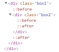
打開chorme的開發者工具來檢視時,可以發現 box1 中有box1::before、 box2 和box1::after共三個元素,而 box2 中又包著box2::before和box2::after兩個元素,所以其實彼此之間的層級是比較複雜了點,在製作上要特別留意這部分,不然就會發生某個元素被蓋掉的狀況出現。
而如果不想那麼麻煩的話,也可以如同範例中,以z-index屬性來做層級的控管,z-index數值比較高的元素,將會覆蓋在z-index數值比較低的元素上,這是比較簡單的管控方法。
小結
只要透過 CSS 就能做出相當多的動畫效果,而且也能減少 HTML 標籤的使用,程式碼看起來也比較簡潔與提高了維護性。不過雖然說偽元素確實很好用,但是有一些特定的標籤如 <img> 、 <input> 等標籤是無法使用偽元素的。原因是因為,要想要 HTML 標籤使用偽元素,必需要這個元素是可以插入內容的,也就是說這個元素要是一個容器,如下所示:
     <!-- div標籤中可以插入p標籤和a標籤 -->
    <div>
        <p>這是一段文字</p>
        <a href="#"></a>
    </div>


    <!-- input標籤中沒有位置可以插入其他標籤 -->
    <input type="text">


    <!-- img標籤中也沒有位置可以插入其他標籤 -->
    <img src="#" alt="#">
以上便是有關偽元素的簡單介紹囉~!
 標籤雲
標籤雲 文章列表
文章列表